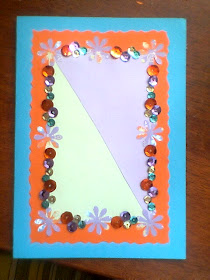
Three years ago, if you told me to make you a Christmas card, it'd look something like that. Really amateur-ish, I know. But in my defence, I have to say that the card looked a lot better in real life than in photo.

Here's a Thank you card that I made. I took a picture of it before I wrote anything on it. It looks much better than my Christmas card. I apologise for the poor quality of the photo. We didn't own a very good camera at the time. Just the other day, when I visited my best friend, whom this card was for, I saw the card again and I was literally astounded. I'm not boasting here but I actually forgot that I was capable of making a good piece of artwork.

So this year, I've branched out a bit. If you read my Buttons post, you would have seen my Christmas snowflake artwork. Apart from that, I've bought and decorated paper folders. This was my first attempt and I wanted it to be fashion themed. No, it doesn't look professional at all. In fact, it looks like something a pre-teen girl would produce. However, from memory, the friend that I gave this to said that she liked it. Who knows, maybe it's been discarded somewhere, left forgetton and to collect dust? I wouldn't blame her at all.

Then, I made another for another friend. I would like to say that I got better at it but I wouldn't dare say so. You judge.

The latest one that I've made. I thought that perhaps simplicity was key. So I created a button theme. I would have liked to take a better photo of it but I wanted to give it to my friend in the morning. So this photo was taken at night. Hence the poor lighting. I did improve on one thing though, this one certainly looks neater!

No comments:
Post a Comment